
Taking a moment, closing your eyes, and imagining a small piece of the world.


THE PROJECT
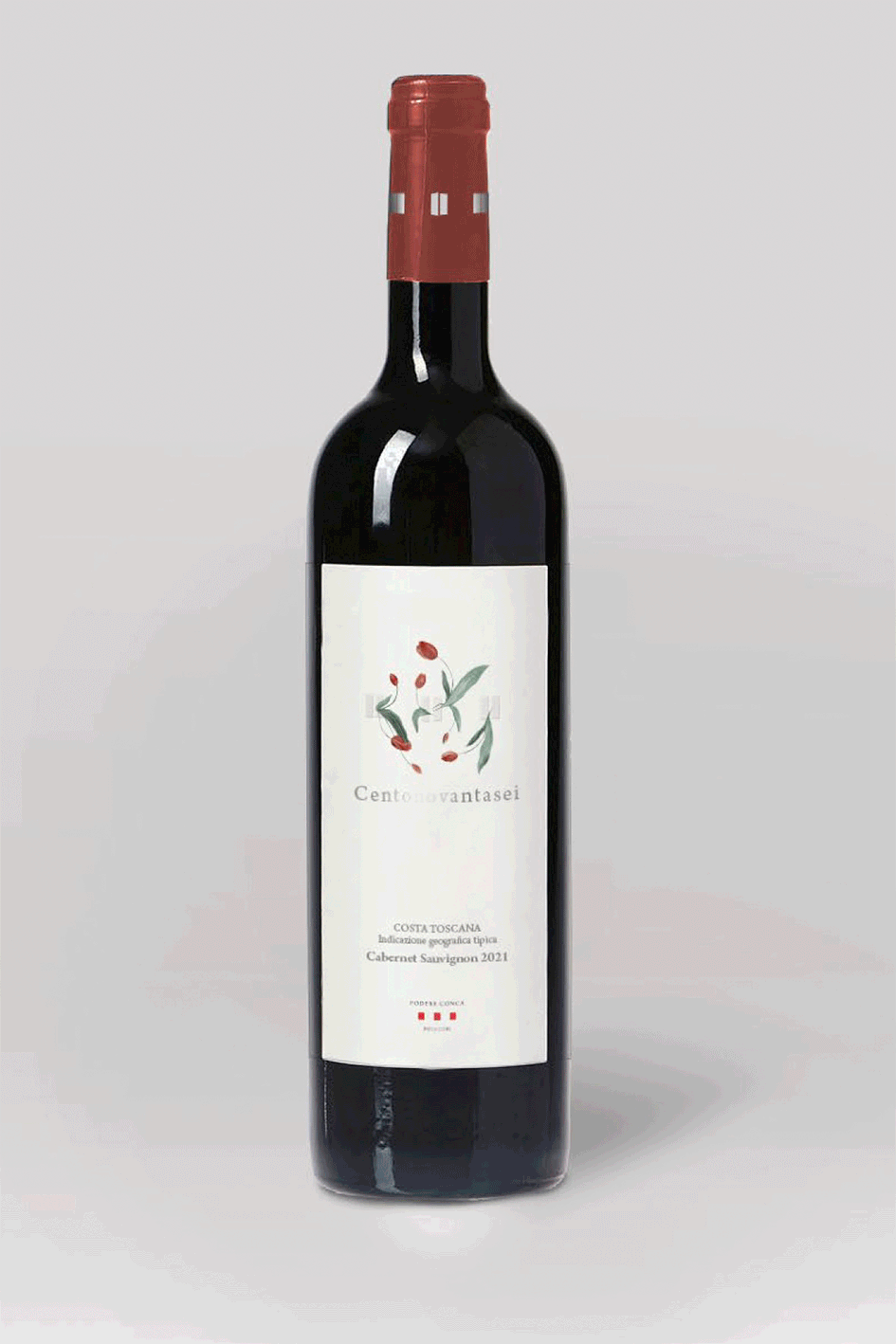
When I started collaborating with Podere Conca Bolgheri, I was invited to their estate to experience the place, learn about the winery’s story, and—most importantly—meet the people behind it. That direct connection with the team shaped the development of the 196 label.
We worked on several versions over a few months, and I’m happy to say that in the end my favourite was the one that got selected.
The idea behind the illustration is to convey wine as a moment suspended in time. The label becomes a window onto a small world the wine can transport us to. I created a landscape inspired by the hills of Bolgheri, with a calm, slightly surreal atmosphere that suggests a sense of pause and stillness.
SOCIAL PROJECT
The first project I created for Podere Conca Bolgheri was actually the illustration and visual design for their cooking series, “Le ricette di Simo.”
It’s a monthly post featuring a recipe paired with one of their wines. The chef I illustrated is a real person—her name is Simonetta, and she’s an amazing cook!


OLIVE OIL LABEL
Designing a product label that, at first glance, might seem similar to others on the market is always a challenge. The image needs to communicate something that goes beyond the visual—something that evokes other senses, like taste.
Another approach is to tell a story: to express a set of values that define the brand and, in turn, shape the identity of the product itself.

The aim of the new olive oil label was to highlight the winery’s roots in the land—its deep connection to a place that is also home, and the strong sense of family behind the business.
For this reason, I illustrated the farmhouse with its red door, along with the olive tree and the flowers that appear across all Podere Conca Bolgheri labels.
